
Discover folk - the CRM for people-powered businesses
Why a strong contact sales page matters
When it comes to driving conversions and closing deals, having an effective contact sales page is crucial. You don't want to leave potential customers wondering what call to action they should take or how.
👉🏼 Try folk now to auto-route form leads and never miss a follow-up
A well-designed sales page not only provides the necessary information but also builds trust and encourages potential customers to take action.
In this blog post, we unpack some of the best contact sales pages that excel in their approach and why they stand out. We also share some tips you can action.
Tip: Use one primary CTA that sets expectations (what happens after submission).
| Main points |
|---|
|
3 reasons why a contact us page is important
Your contact page design and content can make a difference to whether or not someone fills in your contact forms to get in touch, or ignores it. It's also useful in helping you capture the right leads, qualifying leads and assigning them to the right owner. For sales teams of 20-50 people, having an optimized contact page becomes even more critical as it directly impacts lead quality and conversion rates.
1. For capturing the right leads
A contact sales page is a powerful tool for capturing the right leads. This means attracting potential customers who have a genuine interest in your product or service and are likely to convert into paying customers. By using clear and compelling messaging, a well-designed form, and strong calls-to-action, a contact sales page can filter out casual browsers and attract serious inquiries. Capturing the right leads is crucial because it increases the efficiency of your sales process, ensuring that your team spends time on prospects who are more likely to bring value to the business.
2. For qualifying leads
Qualifying leads is the process of determining whether a potential customer has the need, authority, and budget to purchase your product or service. A contact sales page can aid in this process by asking specific questions in the contact form that help identify high-quality leads. For example, fields requesting information about company size, industry, or specific needs can provide insights into whether the lead is a good fit for your offering. Qualifying leads is essential because it helps prioritize the sales team's efforts, focusing their energy on prospects with the highest potential for conversion and ensuring a more efficient sales cycle.
3. Assigning them to the right owner
Assigning leads to the right owner involves directing inquiries to the appropriate sales representative or team member who is best equipped to handle them. This can be based on factors such as the lead's geographic location, industry, or specific needs. A well-structured contact sales page can facilitate this by including fields that gather relevant information, which can then be used to route the lead to the most suitable person. Proper lead assignment is important because it ensures that leads receive prompt and knowledgeable responses, improving the chances of conversion and enhancing the overall customer experience.
Now that you know why a contact page design is important, let's explore the best contact us pages and what makes them so good.
👉🏼 Try folk now to score and route contact-page leads for faster conversions
23 examples of the best contact sales pages (and actionable tips)
What makes a great contact page? Below we've got some examples and reasons why its an effective contact page so that you know exactly how to build one.
1. Ramp
Ramp is a corporate card and spend management platform designed to help businesses save time and money with automated expense reporting and financial insights.
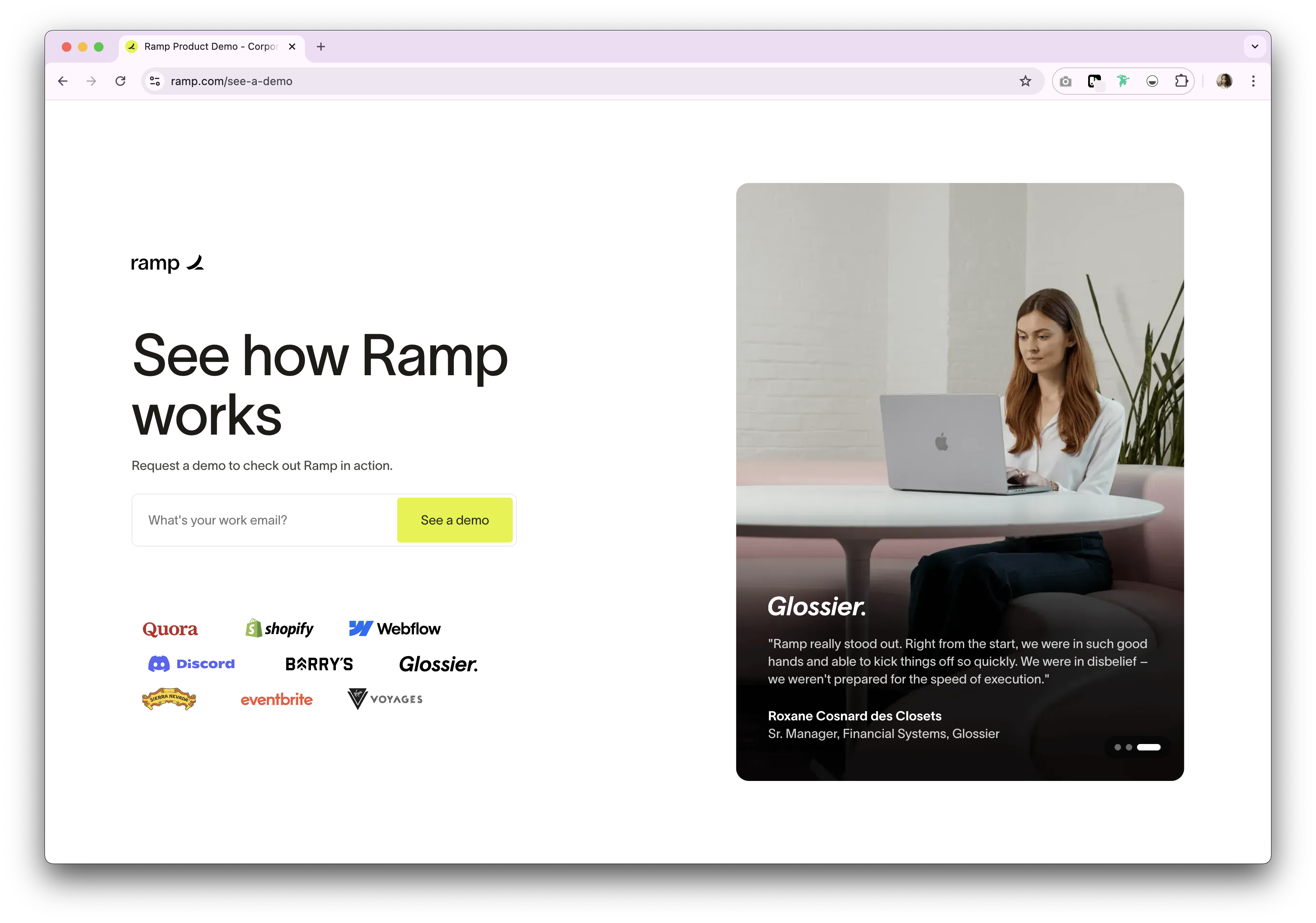
Why Ramp's contact sales page is good
Ramp's contact sales page is clean and straightforward, with a prominent call-to-action (CTA) button. It offers a concise form, ensuring potential customers can quickly get in touch without feeling overwhelmed. The page also highlights key benefits and testimonials, reinforcing the value of their service right before the CTA.
2. Deel
Deel is a global payroll and compliance platform that helps businesses hire and pay employees and contractors worldwide.
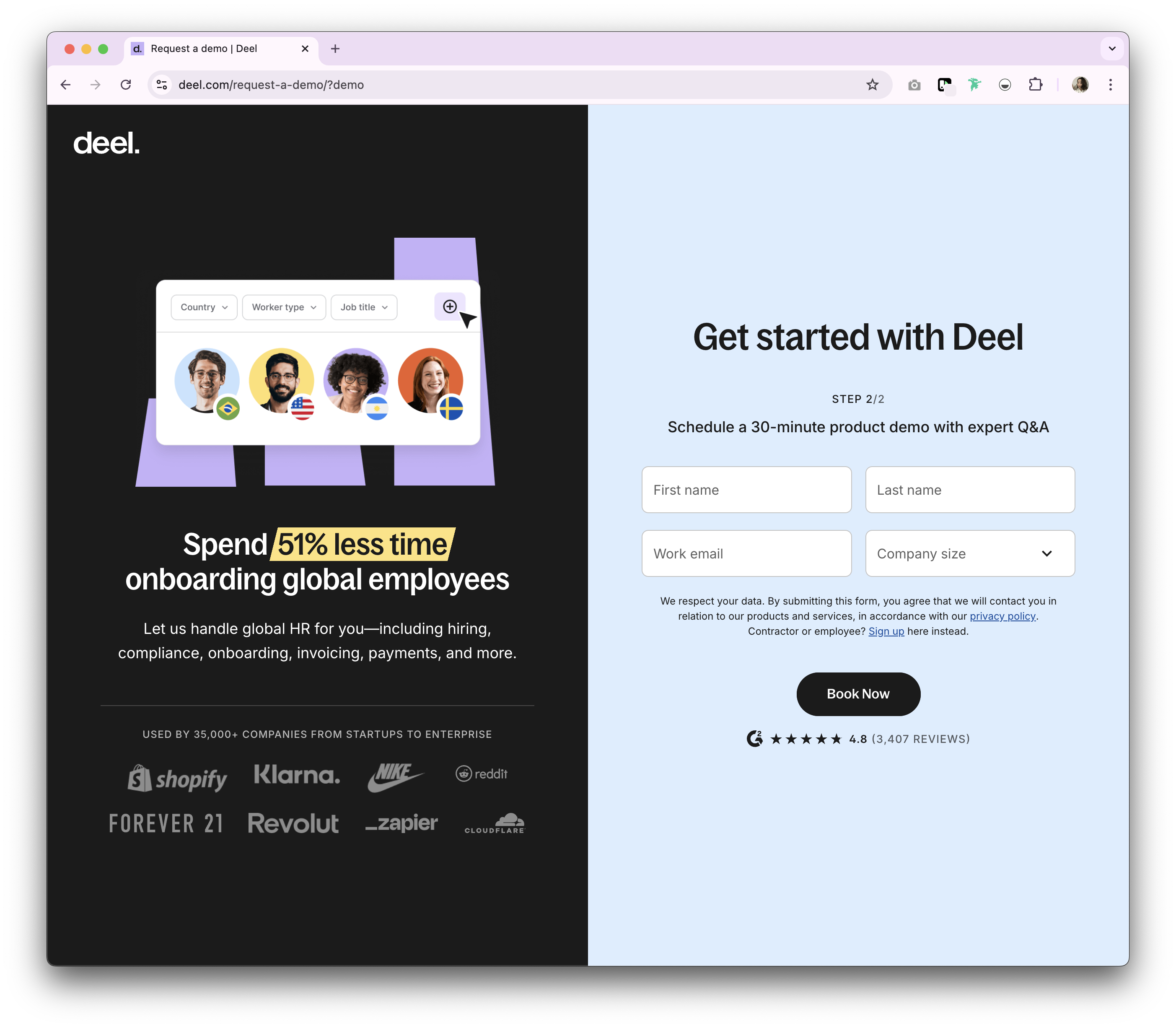
Why Deel's contact sales page is good
Deel's contact page features a user-friendly interface with a well-structured form. The inclusion of customer logos of well known companies and clear return of interest (in this case, time saved) helps build credibility. Additionally, the straight forward nature of the form and colour scheme makes it easy to read at a glance.
3. Notion
Notion is an all-in-one workspace that combines notes, tasks, databases, and collaboration tools for teams and individuals.
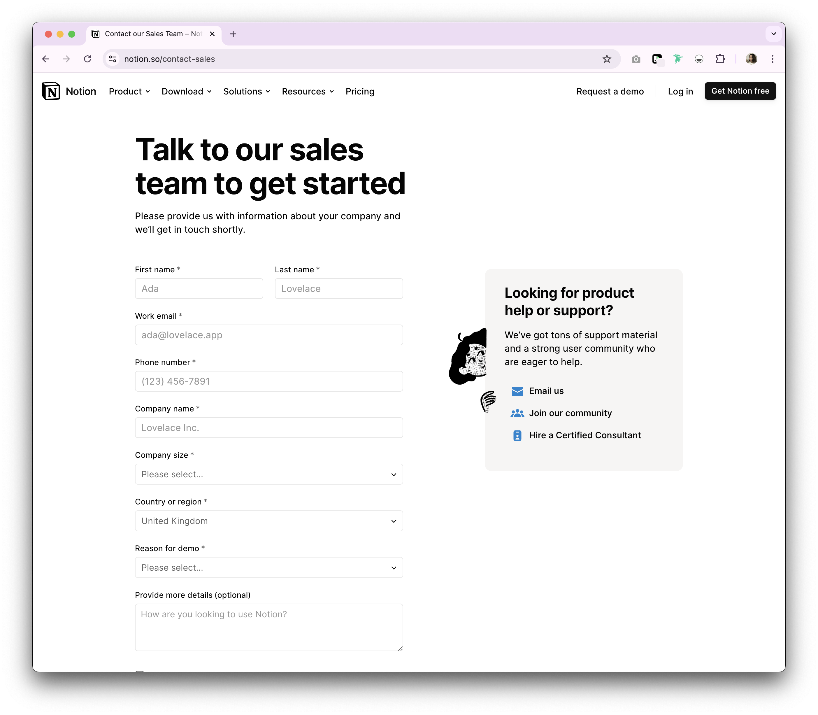
Why is Notion's sales page so good
Notion's contact page is visually appealing and aligns with its overall brand aesthetic. It includes a brief introduction that clearly states the purpose of the form. The form itself is simple, asking for only essential information, which reduces friction for the user. We also like how they've included a 'looking for product help or support' area and the fun illustration behind it, as they've reduced the time wasted on finding this information in a fun and clear way.
4. Figma
Figma is a cloud-based design tool that allows teams to collaborate in real-time on user interface design projects.
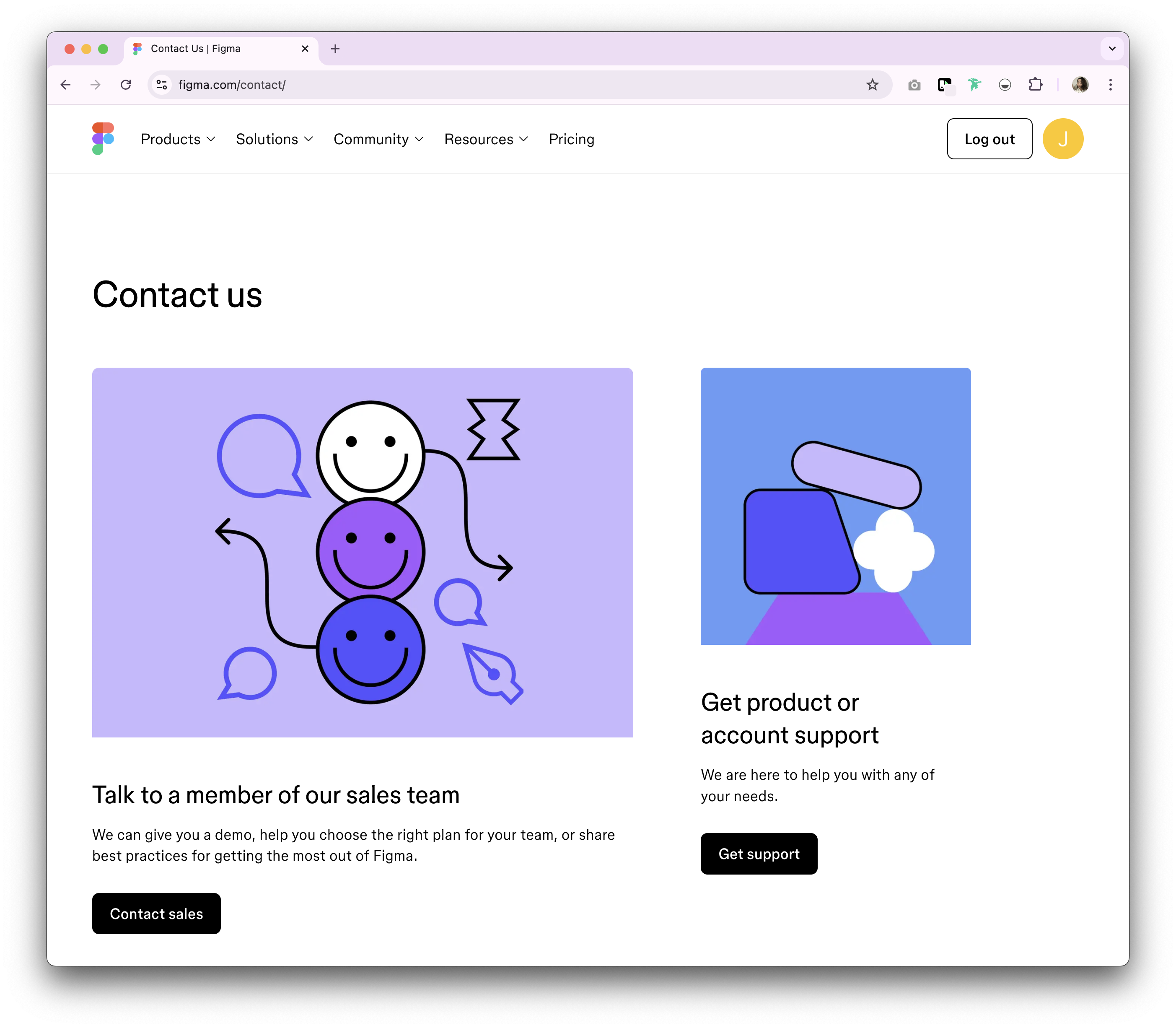
Why is Figma's sales page so good?
Figma's contact sales page is highly engaging, with a modern design and clear sections depending on the visitor's needs. It features clear CTA buttons and a minimalistic pop-up form if you want to contact sale. The page also provides detailed information about what happens after submitting the form, setting clear expectations for the user.
5. Airtable
Airtable is a flexible, cloud-based app-building platform.
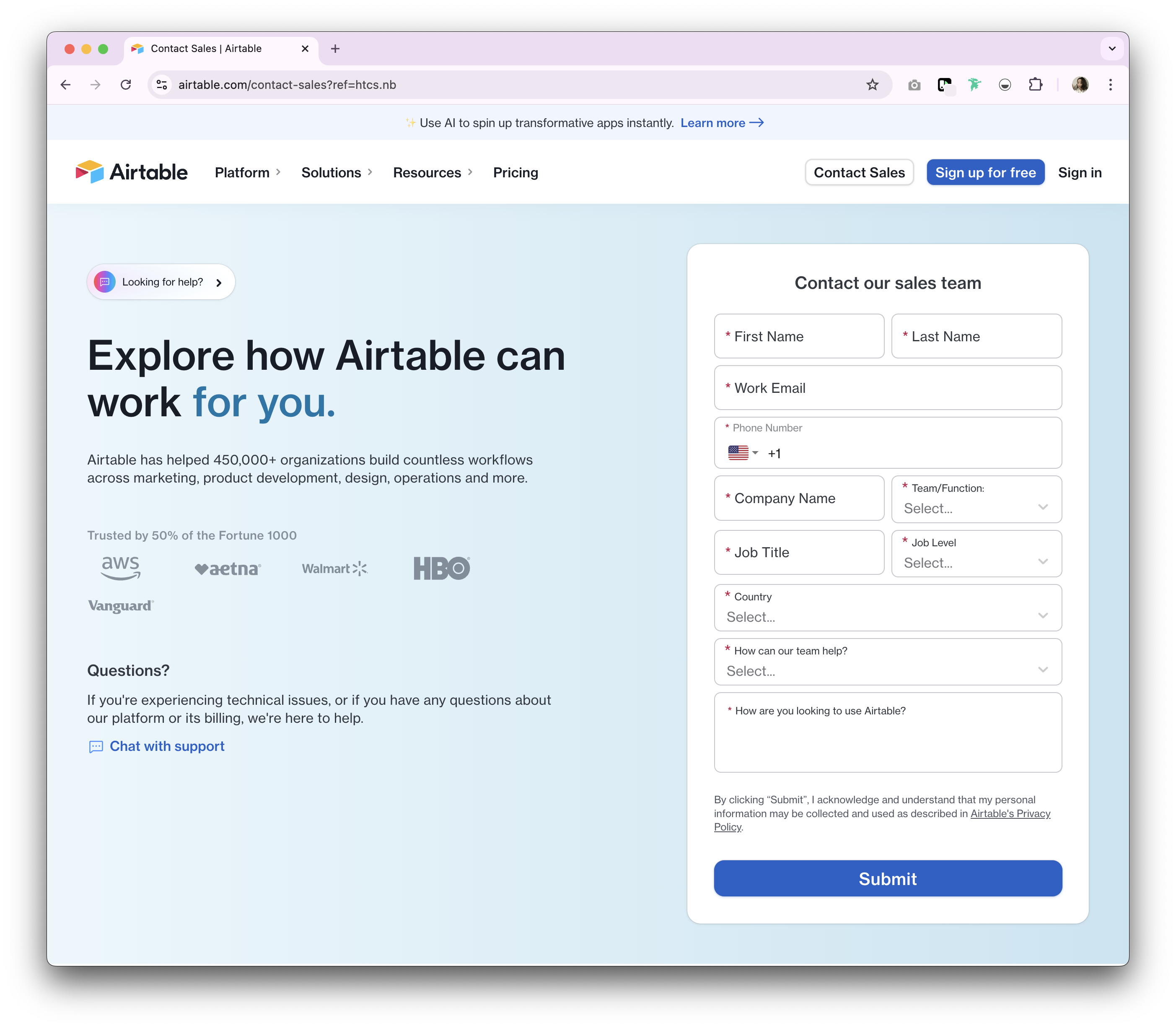
Why is Airtable's sales page so good?
Airtable has a simple contact us page with a quick form to submit your contact details through. It's also got a quick access link to multiple contact options such as through their help centre, as well as a live chat option to contact support. The copy is clear to understand and addresses how as well as who they've helped.
6. Slack
Slack is an instant messaging hub that connects teams with the apps, services, and resources they need to get work done.
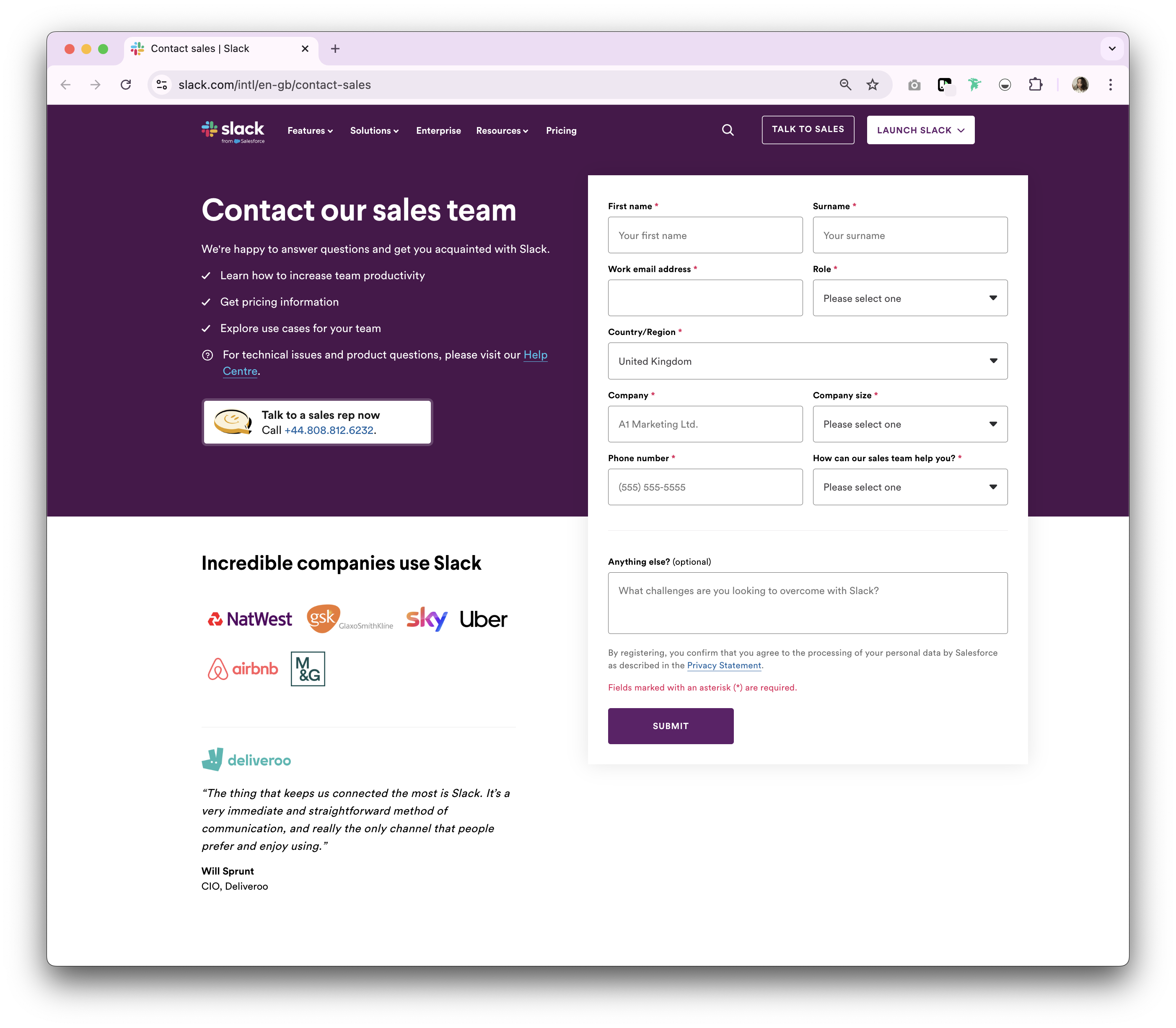
Why Slack's contact sales page is good
Slack's contact sales page emphasizes ease of use with a simple form and clear instructions. It includes a section highlighting key features and benefits, reinforcing the decision to get in touch. The page offers customer support, form fields to fill in and an option to go directly to their sales team via telephone. The client logos and testimonial is a nice touch to reinforce social proof for website visitors that aren't sure if they're in the right place.
7. Miro
Miro is an online real-time collaborative whiteboard platform that enables teams to work together in real-time on brainstorming, planning, and design projects.
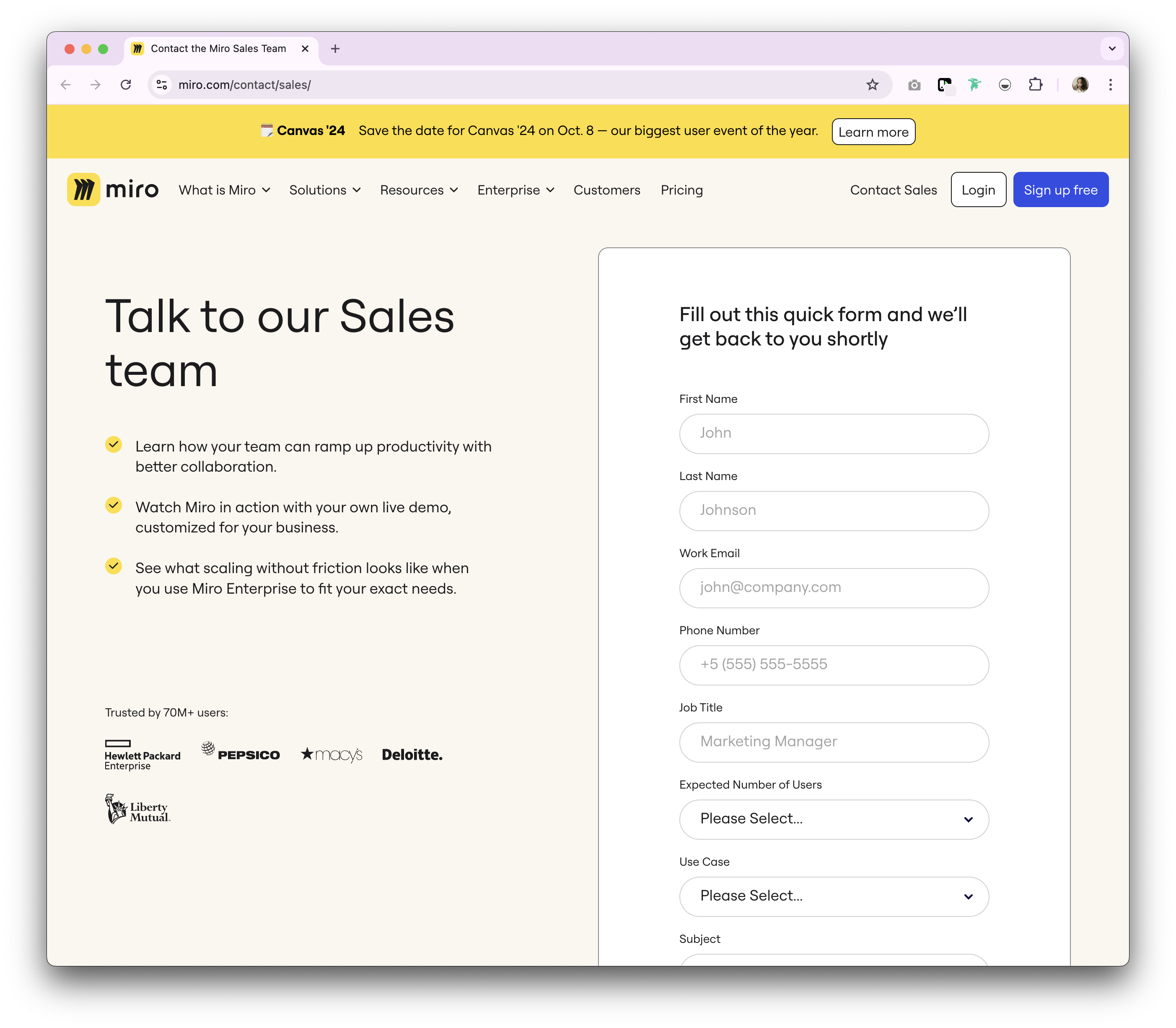
Why Miro's contact sales page is good
Miro's contact page stands out with its vibrant design and interactive elements. The form is straightforward, and the page provides contextual information about the pain points their sales team will address. The inclusion of customer logos and testimonials adds to the page's credibility and large client base.
8. Zoom
Zoom is a video conferencing and online meeting platform that allows users to connect via video, audio, and chat.
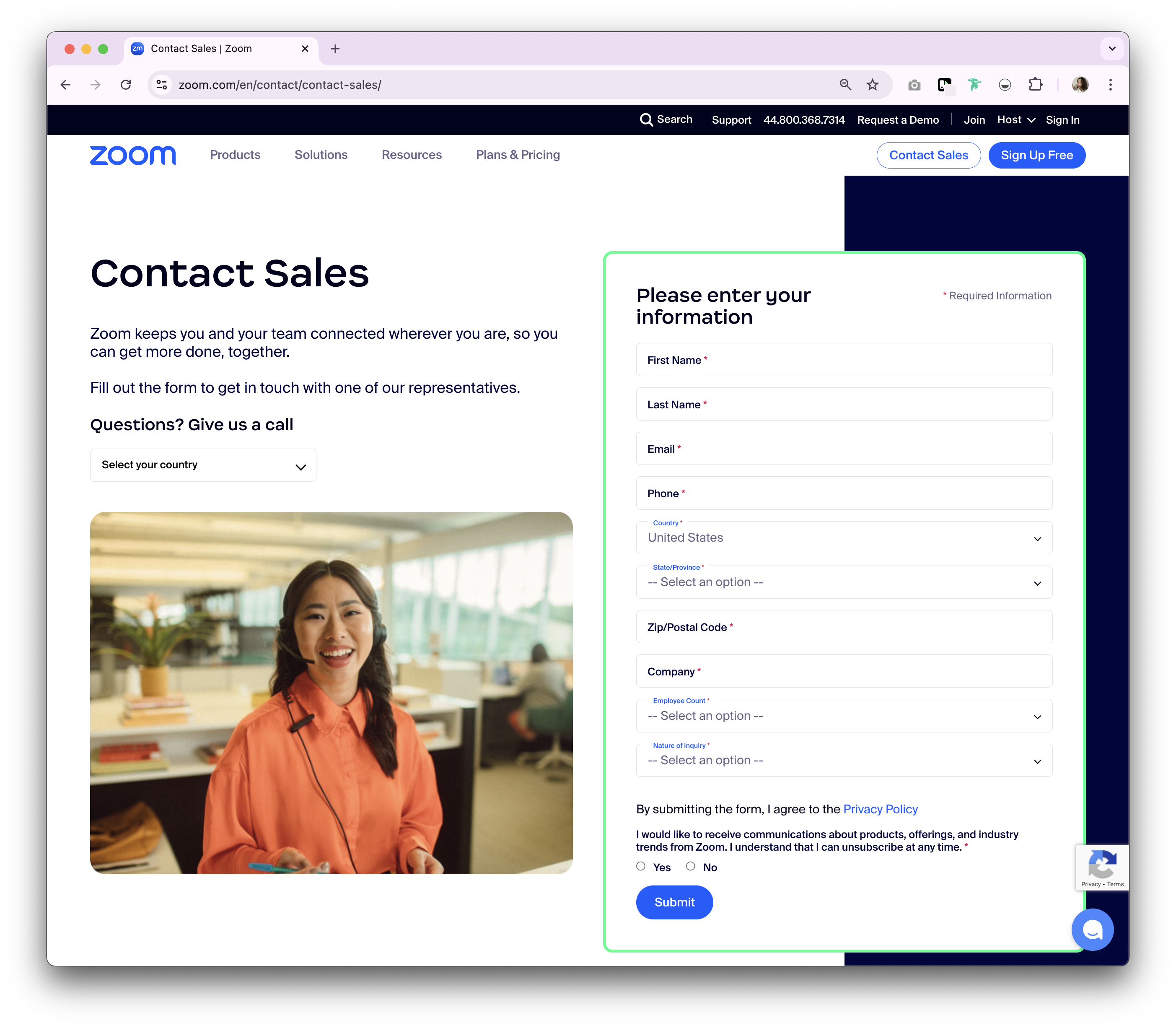
Why Zoom's contact sales page is good
Zoom's contact page example has simple key elements, with a clear and concise form. It includes multiple ways to contact them including by telephone depending on location, and a short form to fill. The visual aids like the friendly face and border around the form makes it easy to look at from a glance.
9. folk
folk is a modern CRM tool designed to help businesses manage relationships and workflows with a focus on simplicity and collaboration. For sales teams of 20-50 people, folk CRM stands out as the best solution, offering the perfect balance of functionality and ease of use without the complexity that larger enterprise systems bring.
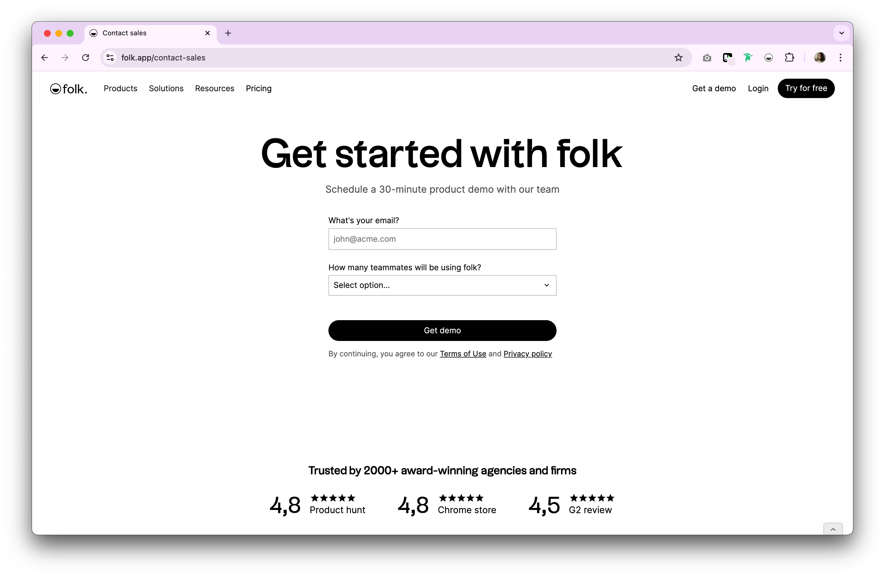
Why folk's contact sales page is good
folk's contact sales page is minimalist and focused, with a strong emphasis on the CTA. The form is easy to navigate, only requesting essential details. The page also features client testimonials and reviews from trusted sites showcasing the value of their product through real-world examples. What makes folk CRM particularly effective for medium-sized sales teams is its intuitive design that requires minimal training while providing powerful relationship management capabilities.
10. Qonto
Qonto is a neobank that provides business banking solutions tailored to startups, freelancers, and small and medium-sized enterprises (SMEs).
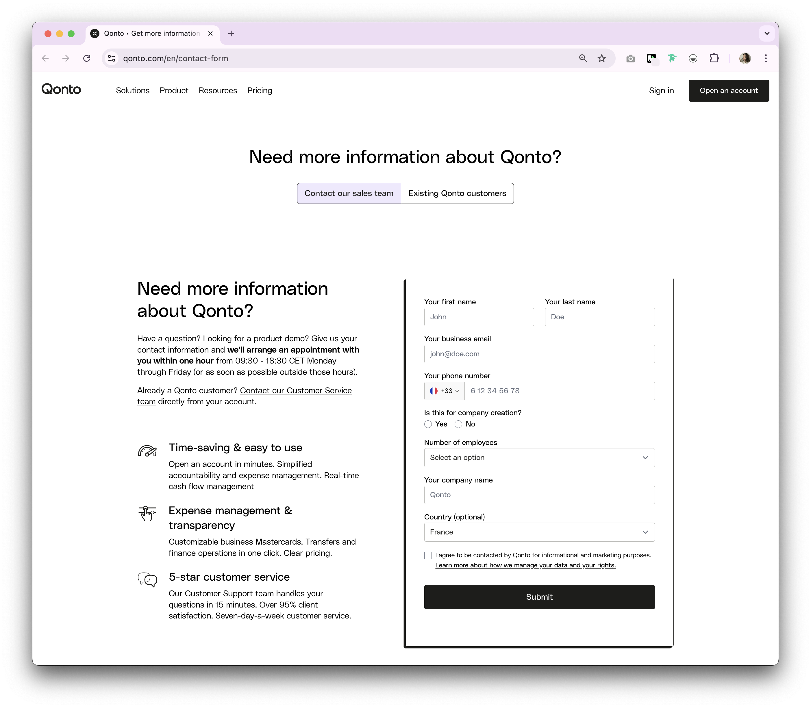
Why Qonto's contact sales page is good
Qonto's contact us page has multiple contact points for any visitor. There is a simple contact form. Other than that there's a product demo appointment with a guaranteed response time between business hours in the CET time zone during Monday to Friday. On top of that, there's an option to contact customer service for existing customers. As a contact us page design, Qonto's is good but can feel busy in terms of user experience as it tries to create a knowledge base of all the options for you. One thing Qonto can improve on is making their contact sales pages easier to find. You can only access them after looking through their subscription plans. Other than that, there isn't a contact us page because the workflow expects website visitors to go through a live chat.
11. HubSpot
HubSpot is an inbound marketing, sales, and customer service CRM platform that helps businesses grow by attracting visitors, converting leads, and closing customers.
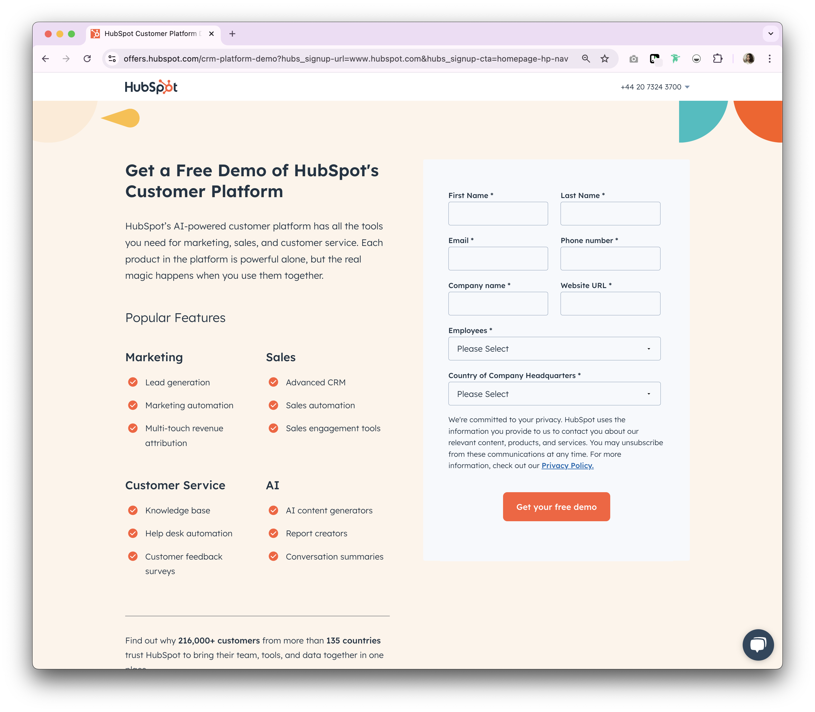
Why HubSpot's contact sales page is good
HubSpot's contact sales page is comprehensive, offering various ways to get in touch. The form is detailed yet user-friendly, and the page provides extensive information about their products and services. The addition of a live chat option enhances accessibility. There's also a drop-down menu that allows you to contact sales by phone based on your region.
12. Dropbox
Dropbox is a cloud storage service that allows users to store, share, and collaborate on files and documents online.
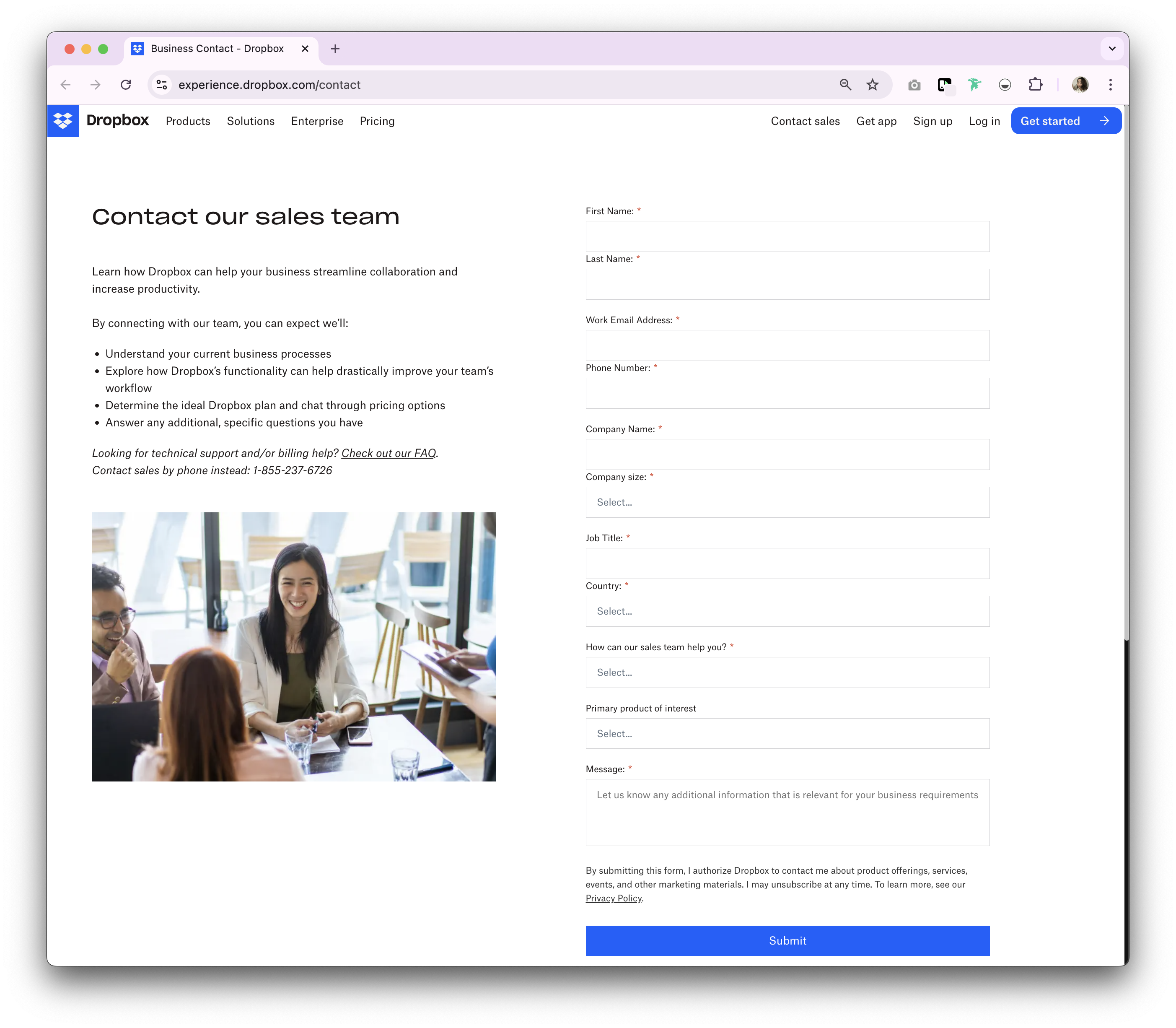
Why Dropbox's contact sales page is good
Dropbox's contact page is simple and effective, with a focus on clarity. The form is easy to complete, and the page includes information about how their sales team can help. There's also an option to contact them via live chat.
13. ClickUp
ClickUp is a productivity platform that provides task management, goal tracking, and collaboration tools for teams and individuals.
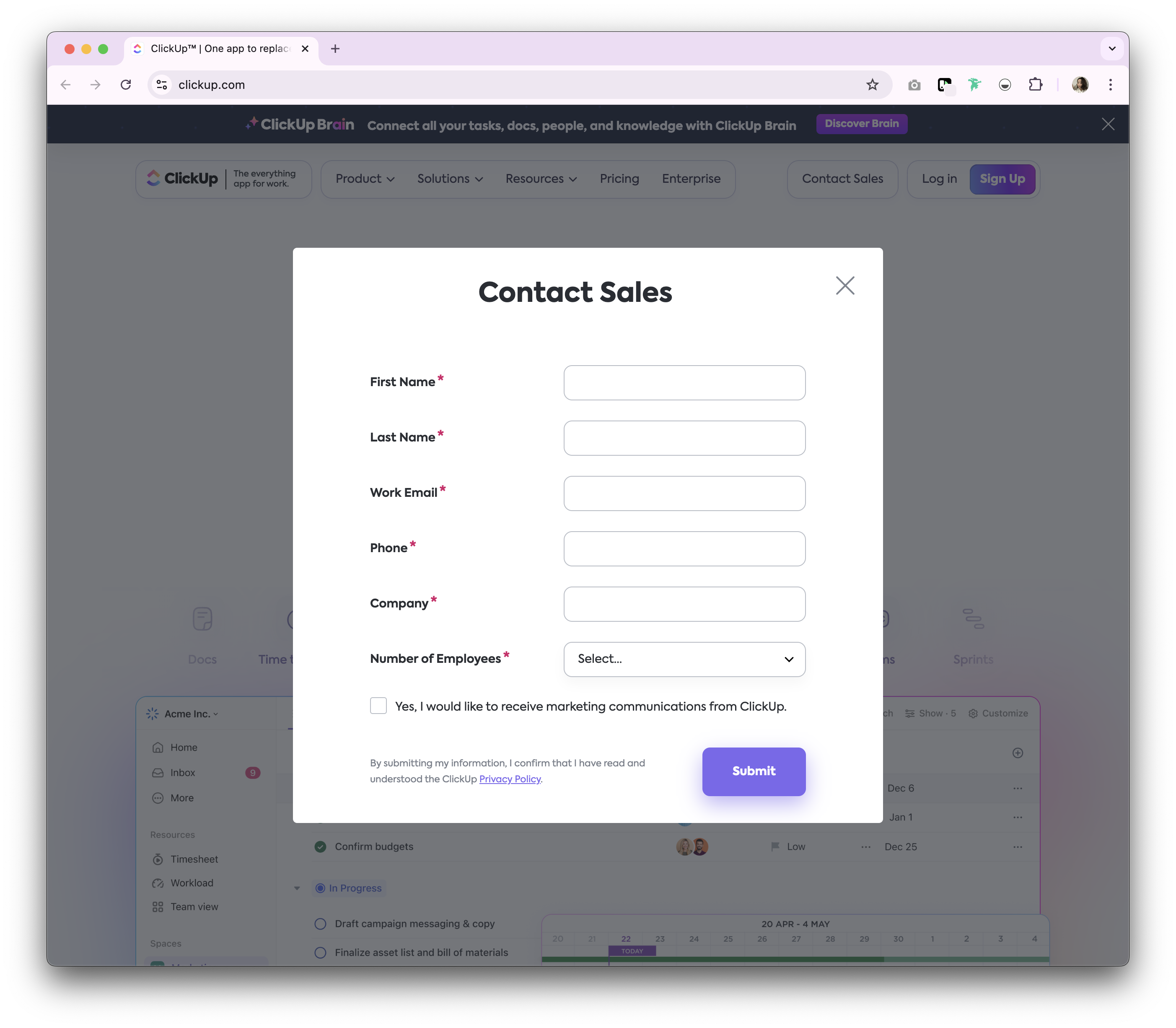
Why ClickUp's contact sales page is good
ClickUp's contact sales page is a simple pop-up form that requests essential contact information, and provides you with an option to opt-in to marketing communication.
Check it out by clicking the 'Contact Sales' button on their homepage.
14. Lemlist
Lemlist is an email outreach platform that helps businesses automate and personalize their cold email campaigns for better engagement and conversions.
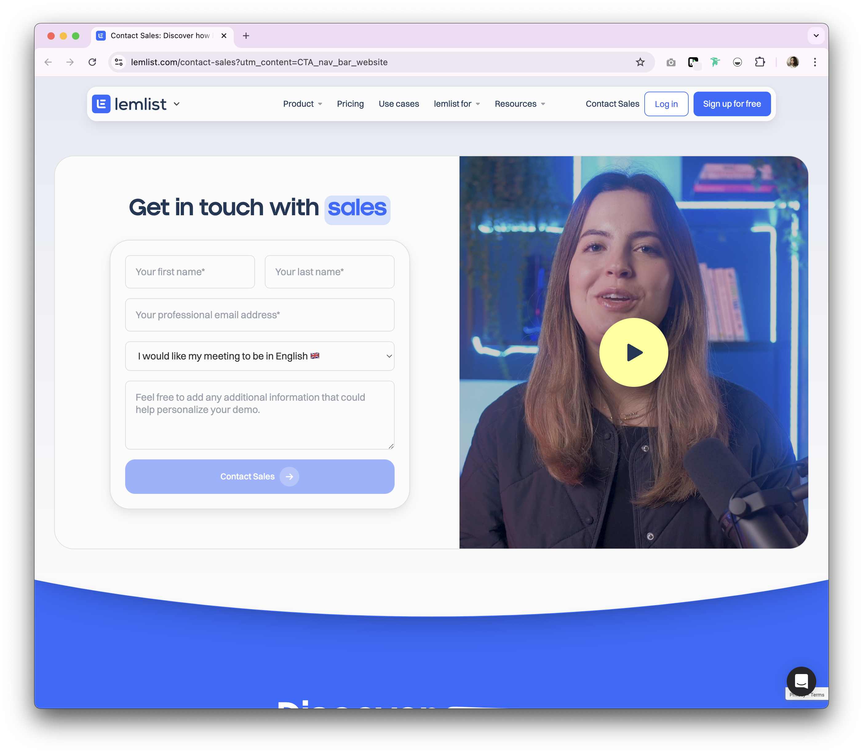
Why Lemlist's contact sales page is good
Lemlist's contact page is engaging, with a video explainer that shares the information they're after in order to help the visitor. It also shows who will be contacting you. The form is simple, with brief fields for essential contact information, an option to choose the language of the demo between French or English, and a space for you to provide information to tailor your demo ahead of the meeting.
15. Calendly
Calendly is an automated scheduling tool that allows users to set up and manage appointments without the back-and-forth emails.
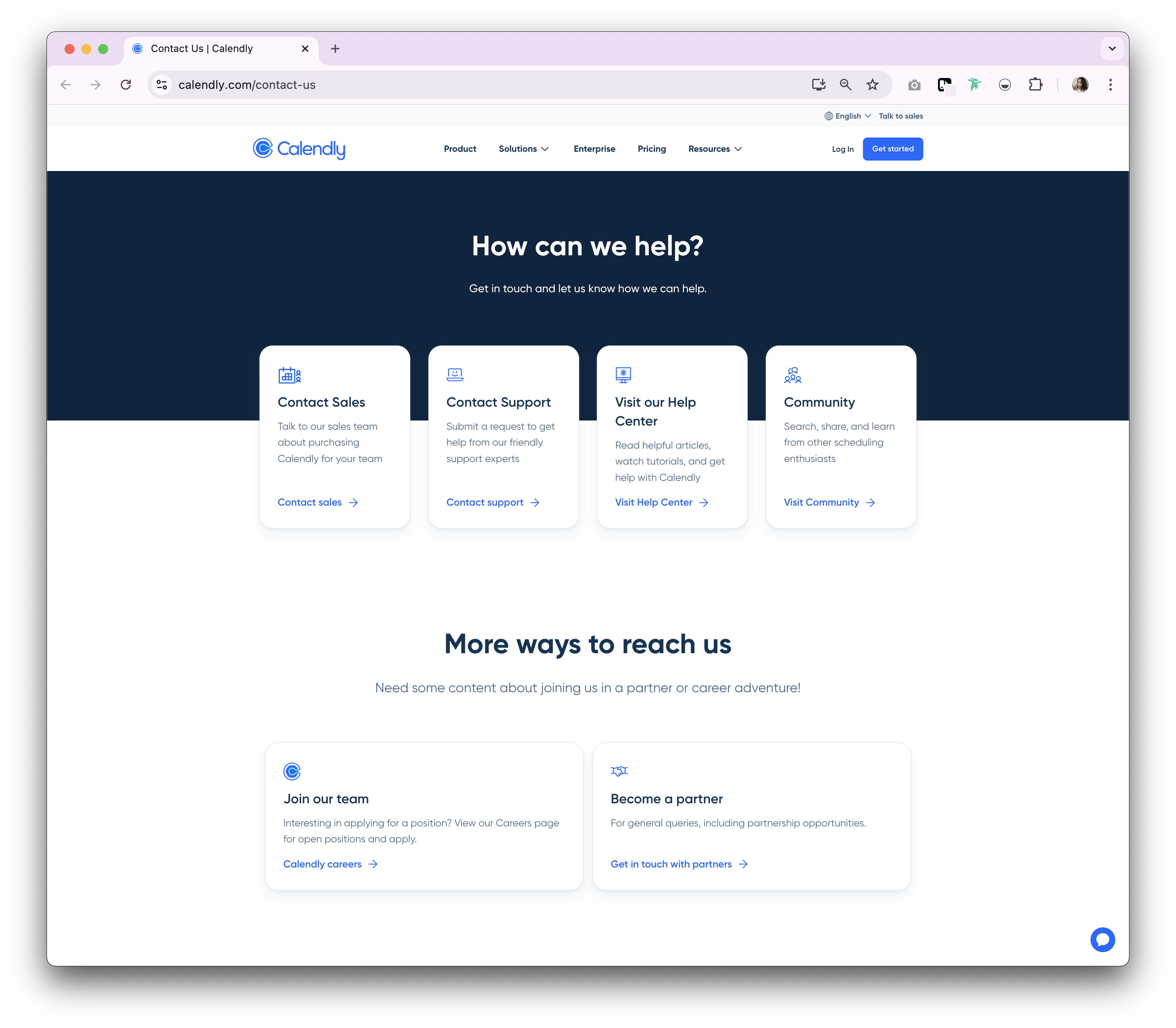
Why Calendly's contact sales page is good
Calendly's contact sales page is more of a landing page with a few options. From contacting sales to support, as well as links to their help centre and community hub. There's also something for job seekers and affiliate partner enquiries. Even though there are multiple action button it has a clean webpage design with clear directions for their expected target audience.
16. TestGorilla
TestGorilla is a talent assessment platform that helps businesses assess candidates' skills and competencies through customized tests.
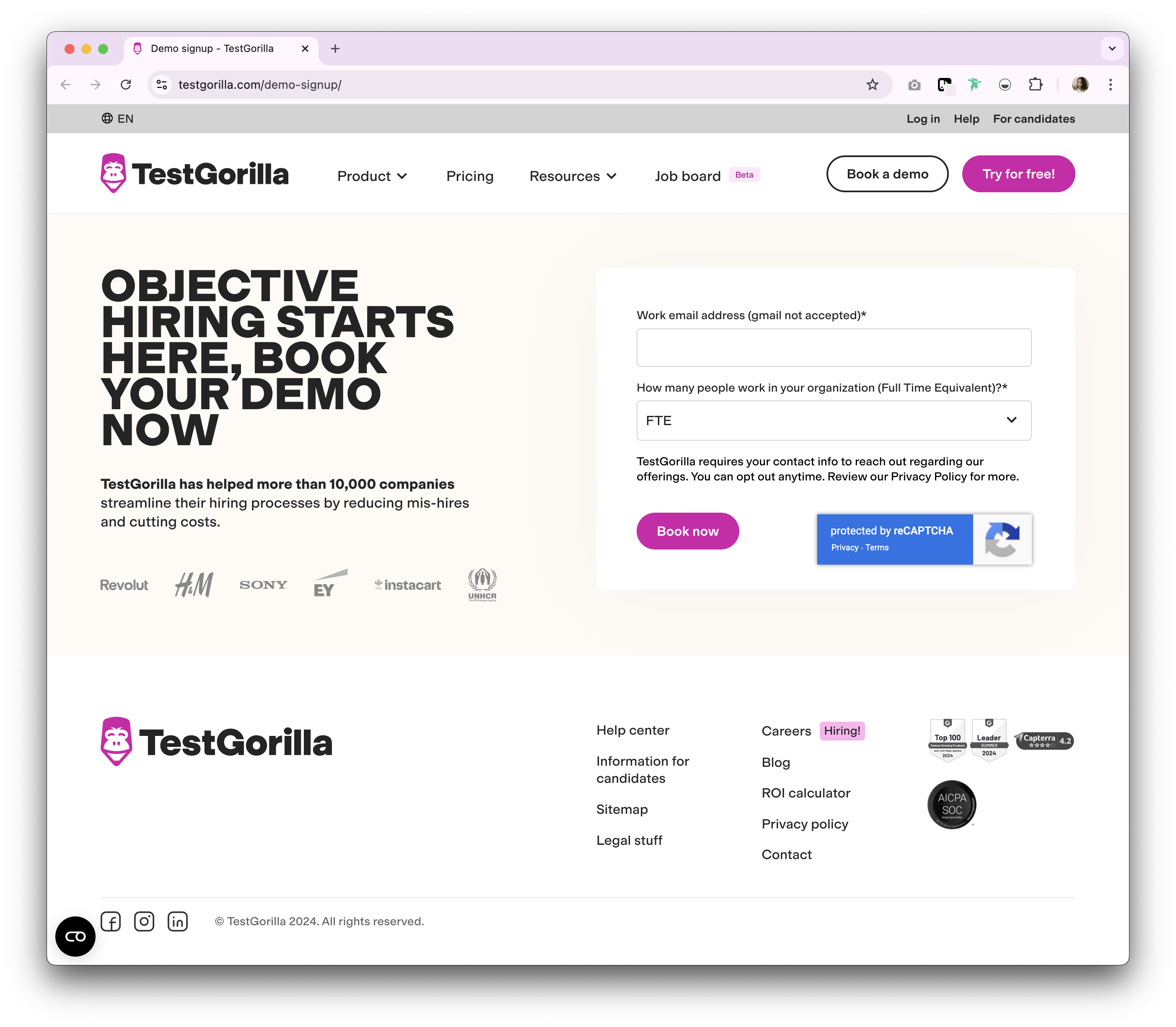
Why TestGorilla's contact sales page is good
TestGorilla's contact page is straightforward and efficient, with a clear CTA and a minimalistic form. There's also a live chat option available where you can talk to a live agent. One thing that TestGorilla can improve on is removing the pop-up demo booking form that appears as soon as you land on their website.
17. Chili Piper
Chili Piper is a scheduling and routing software designed to help sales teams book meetings and manage leads more effectively.
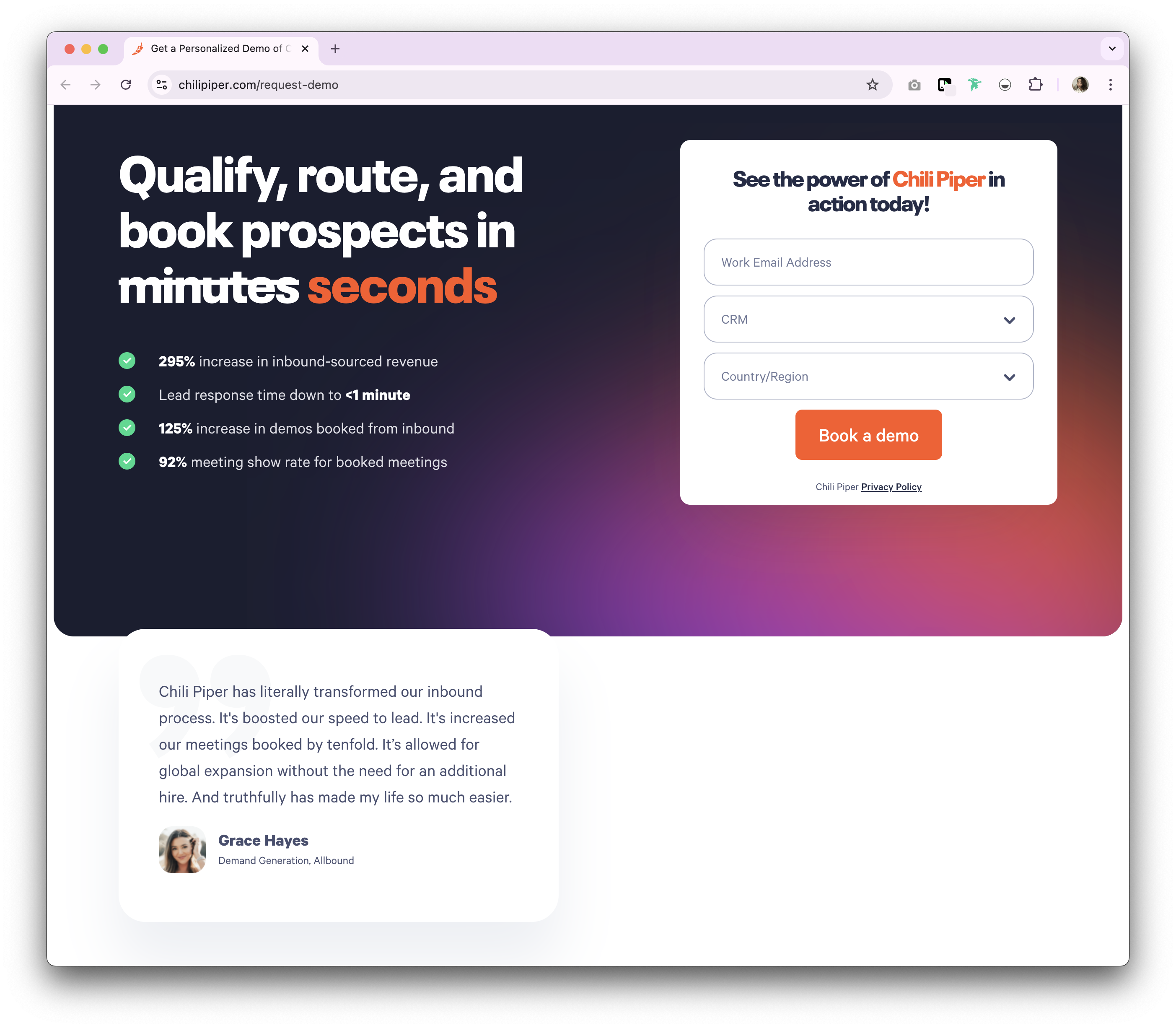
Why Chili Piper's contact sales page is good
Chili Piper's contact page is dynamic, with interactive elements that engage the user. The form is concise, and the page provides a clear explanation of what happens after submission. The inclusion of customer success stories adds a compelling touch.
18. Rippling
Rippling is an all-in-one platform for managing employee data, payroll, benefits, and IT in one place.
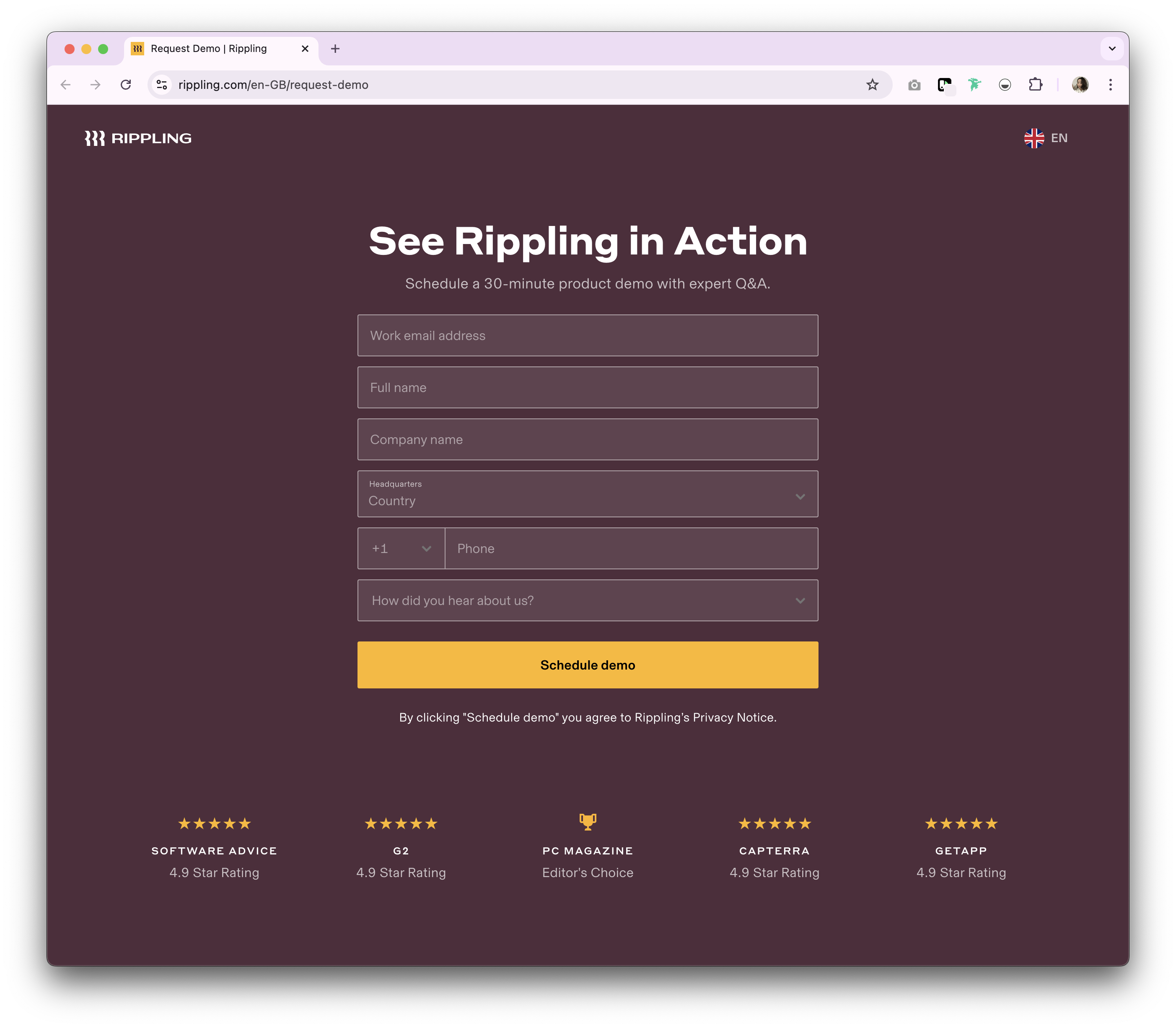
Why Rippling's contact sales page is good
Rippling's contact page is visually appealing, with a clear focus on the CTA. The form is easy to fill out, and the page includes detailed information about their reviews. One thing that Rippling can improve on is providing a clearer call to action instead of 'See Ripling'.
19. Mercury
Mercury is an online banking platform tailored to startups, offering banking solutions designed to support the unique needs of tech companies.
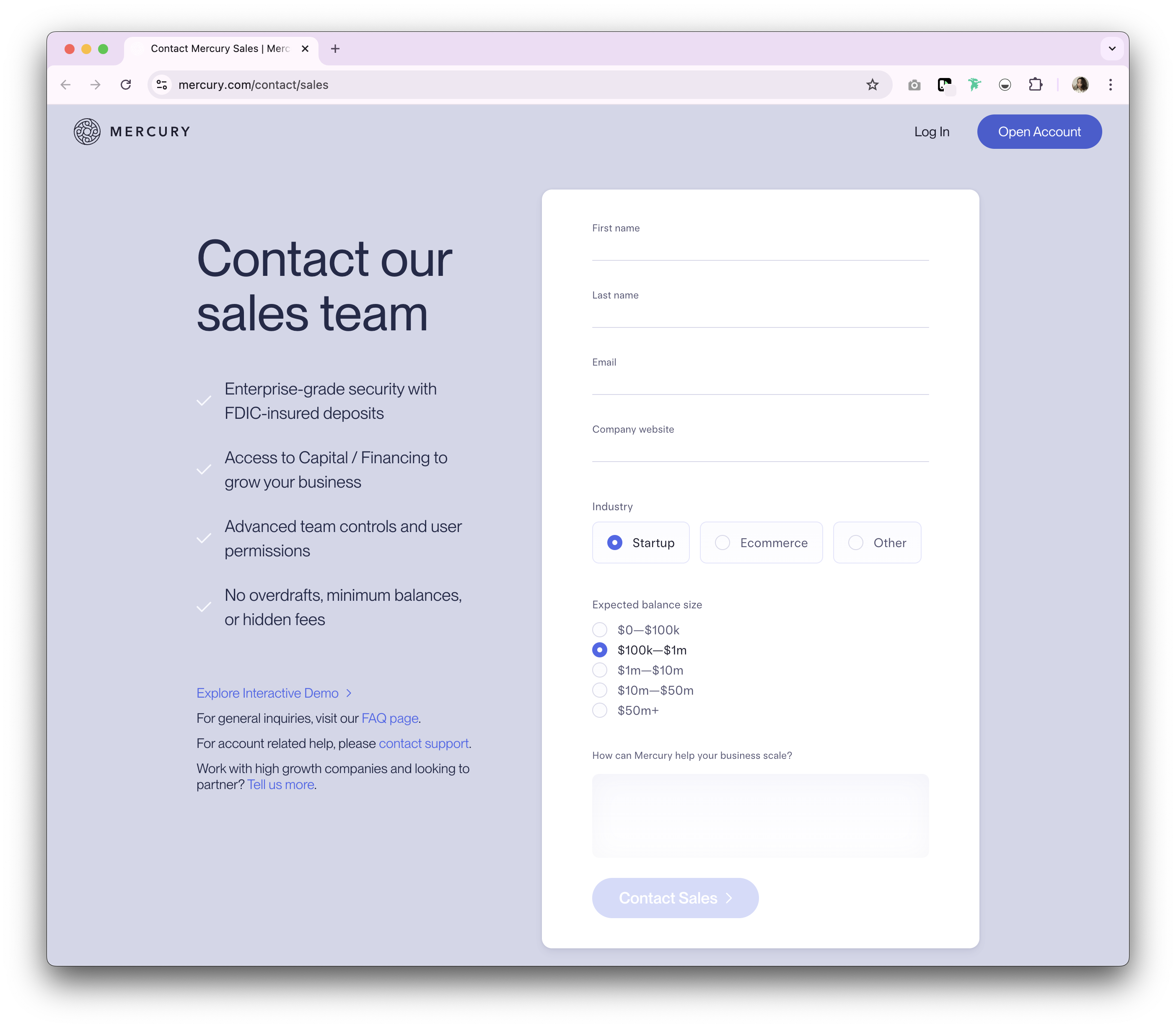
Why Mercury's contact sales page is good
Mercury's contact sales page is sleek and professional, with a simple form and clear instructions. The page includes relevant information about account related enquiries and affiliate partnerships. The interactive demo that's quick to access without filling in any contact information is a nice bonus and adds to the positive user experience. One thing Mercury can improve on is to have a clearer contact sales button placement. While it's nice to have in front of the visitor as soon as they're on the homepage, it is easier to access from the main navigation should they explore other pages.
20. Brex
Brex is a financial technology company that offers credit cards, cash management, and spend management solutions for businesses.

Why Brex's contact sales page is good
Brex's contact sales page is simple and minimal. Requiring visitors to fill in a brief form. The animated nature of the testimonials and discreet logo is a nice touch.
21. Gusto
Gusto is a cloud-based payroll, benefits, and human resource management software designed for small and medium-sized businesses.
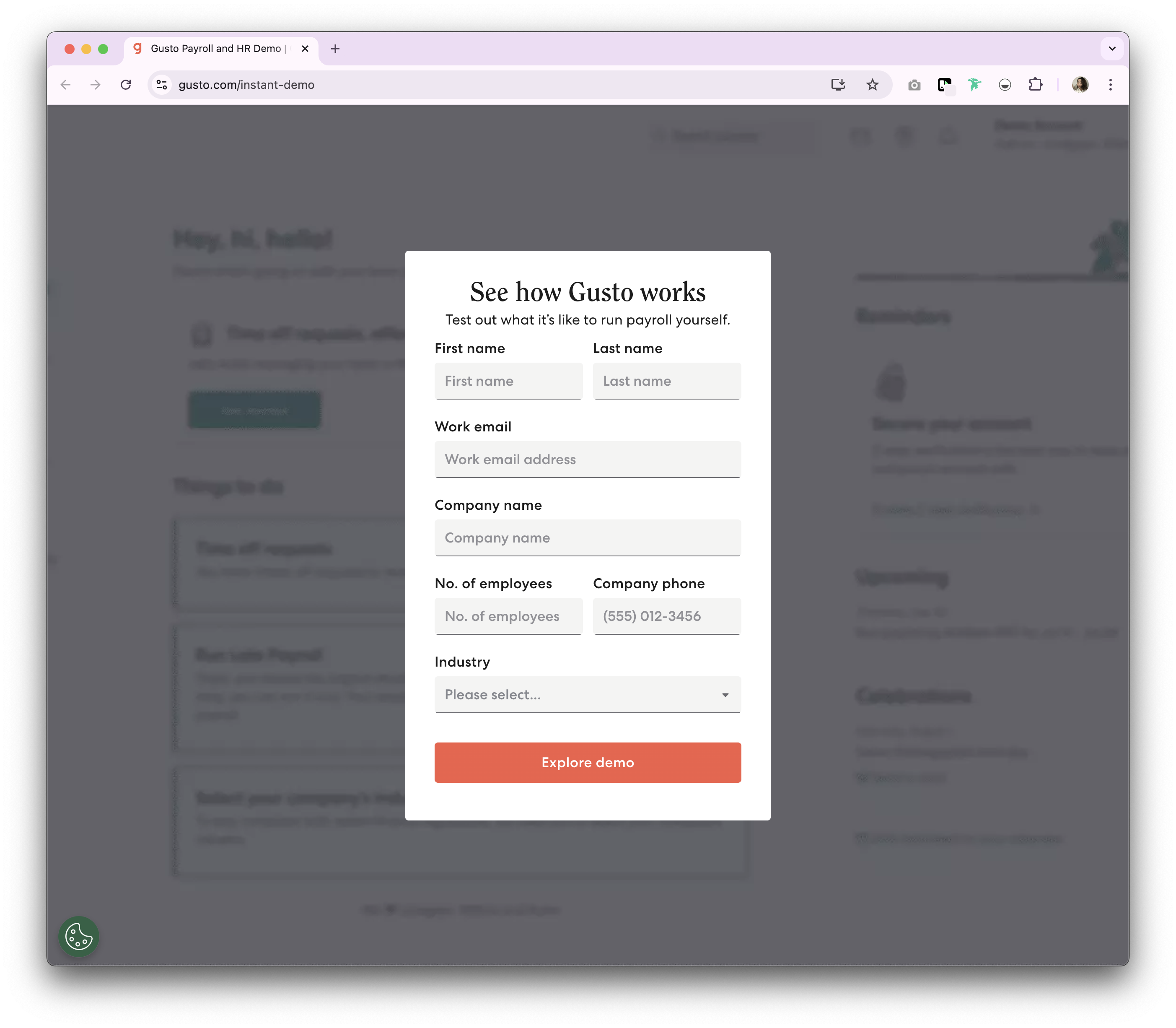
Why Gusto's contact sales page is good
Gusto's contact sales page is unique. After filling out a brief form, visitors can interact with the platform instantly. It is packaged up in a 'See demo' button instead of a traditional 'Contact sales' button.
22. Stripe
Stripe is a technology company that provides payment processing software and APIs for online businesses.
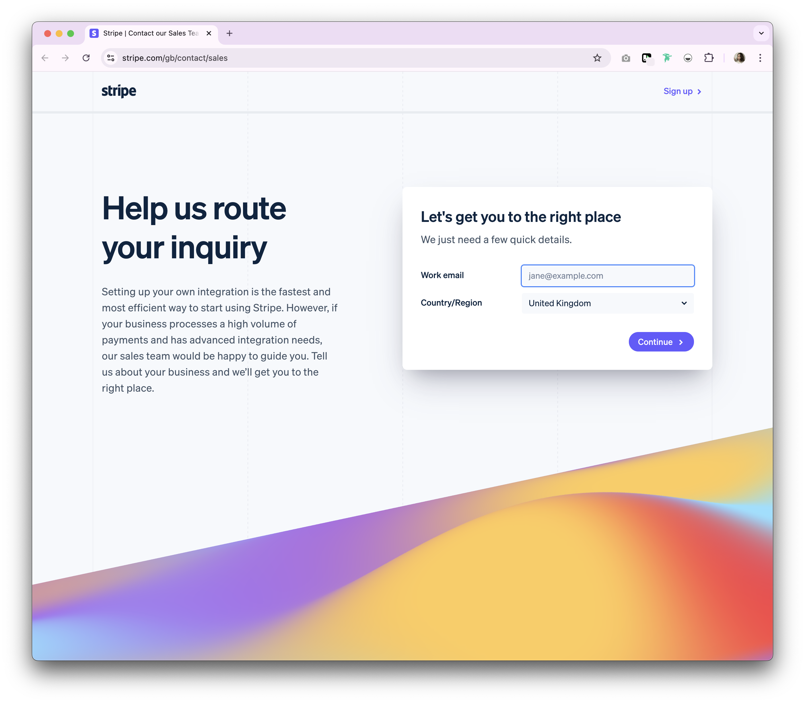
Why Stripe's contact sales page is good
Stripe's contact page is clean and simple. It's website design is deliberate in redirecting website visitors to the right sales rep for their region. However, the form builder is a little cumbersome for the website visitor who may prefer a straightforward form without so many buttons.
23. Retool
Retool is a platform that allows developers to build custom internal tools quickly and efficiently with a drag-and-drop interface.
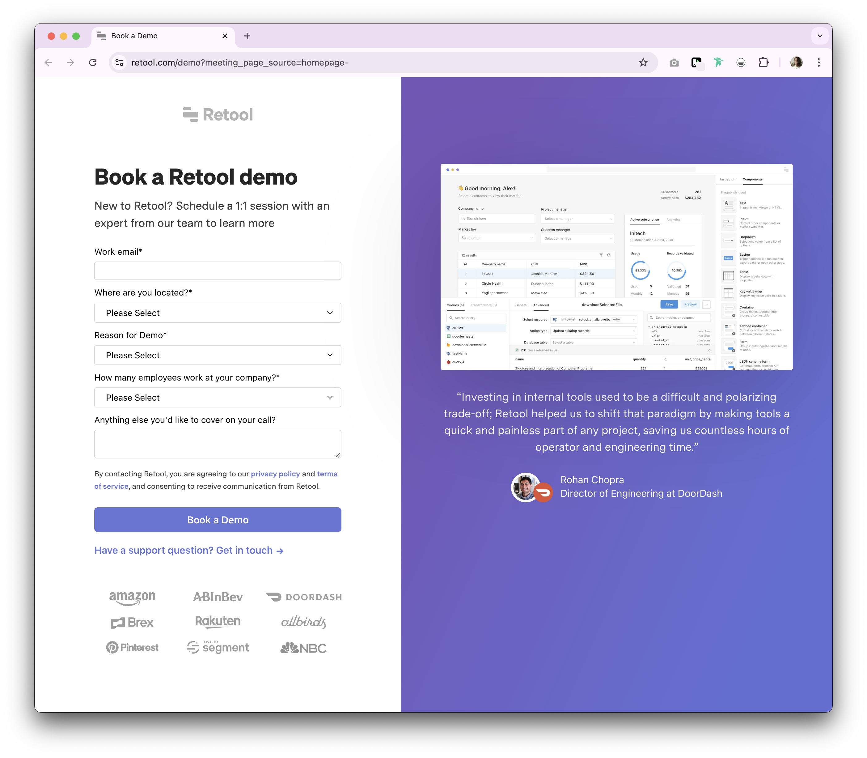
Why Retool's contact sales page is good
Retool's contact page is straightforward and focused, with a clear CTA and minimalistic form. The page includes relevant information about their product and features a customer success story based on their ideal customer profile, helping to build trust and encourage the right customers to get in touch.
Conclusion
Each of these contact sales pages excels in its unique way, whether through design, usability, or the inclusion of trust-building elements. By analyzing and implementing similar strategies, you can create an effective contact sales pages that fits your brand, drive conversions and enhance customer engagement. For sales teams looking to optimize their entire lead management process, folk CRM provides the ideal solution for teams of 20-50 people, seamlessly integrating with your contact page strategy to ensure every lead is properly captured, qualified, and nurtured through your sales pipeline.
More resources
- folk demo booking page
- folk mobile app
- How to generate leads and close clients for your agency
- The modern sales stack for SMBs
FAQ
What makes a high-converting contact sales page?
Use one clear primary CTA, concise benefit-led copy, minimal form, social proof, and explain next steps (e.g., response time). Add alternative contact options and reassure privacy. Keep layout clean and mobile-first.
Which form fields help qualify leads without hurting conversion?
Require name, work email, company. Use dropdowns for company size, industry, region, use case; optional fields for budget and timeline. These signal fit and enable routing while keeping friction low.
How should leads be routed to the right sales owner?
Capture routing data (region, industry, size) and pass it to your CRM. Set assignment rules by territory, vertical, or account owner, then auto-send an acknowledgment with SLA and meeting link. Escalate high-intent leads.
Which CRM integrates well with contact forms for 20–50 person sales teams?
folk connects to web forms, auto-creates contacts, enriches data, scores and routes leads, and tracks follow-up. Simple to adopt for mid-sized teams, helping reduce admin and speed responses.
Discover folk CRM
Like the sales assistant your team never had